Category Archives: Tools

When did email break?

I am trying to work out when email broke. I think it was about 18 months ago, maybe a year ago. No-one replies to emails any more.

I think it’s because we read them on our smart phones, but we’ll only reply to the easy ones when we’re on the move. Anything more complex we’ll leave till later and, as I learned when negotiating with my mother, later never comes.

Two or three years ago, five or fifteen years ago, emails worked. You would send an email and someone would respond within a few hours, a day at most. You would reply or send another and they would respond to that one. Email was faster and more flexible than letters, more private than faxes (unless you made the tee-hee-hee “classic” “newbie” mistake). It was great.

Recently I have been working on the schedule for Skeptics on the Fringe, and it’s been frustrating. It feels inappropriately public to make the first contact via Twitter and too in-your-face to make the first contact by phone. However, approaches by email are caught by spam filters or suffer from the double-bounce drop (if your email’s too complicated to be returned on the first bounce, it will be dropped).

I worked in times BC (Before Computers). Then I would have used the phone far more when I was confirming the schedule with the speakers, written letters quite a bit and maybe exchanged some faxes, instead of what I did today which was to use a mixture of email, twitter, FB messenger, texts, phonecalls and skype.

I am not certain which day would have been more productive, but I think I’d have been more productive BC.

We all used the phone more as a business tool, but these days I am shy of phoning people without arranging a time first, and when I do arrange a time to speak to someone call it “skyping”.  Today I got my rapid answers via Twitter, Chat, Skype, and Facebook messenger.

Would the letters have got a better response than the emails will now? I think so. People opened their post and put it in an In Tray and worked their way through it. Ideally you would deal with each piece of paper only once using one of the Three Ds (Do, Delegate or Dump). I am now trying to remember when I last saw an actual In Tray on an actual desk that isn’t in a post room. People mean to do that with emails, but the new wave of crap coming in drowns the previous wave of crap to be dealt with.

I am quite tempted to start writing letters again, just for kicks and giggles. Novelty works. In those early years of my working life, a fax was a good way to get someone’s attention because it was an urgent and important thing and the receptionist would bring it round immediately. But no-one has fax machines any more, there’s no “reply” link on a letter, no click through to our website, and stamps are 60p each.

So was BC was a pre-lapsarian age of artisan communications? When I started writing this post I thought “don’t be silly” but the more I re-wrote it, the less certain I became. With my rose-tinted specs on it seems like a golden age but Time Management™ courses and complicated products which were basically diaries in ring binders were heavily marketed suggest that someone made a lot of money out of other people being inefficient.

Instead, I shall think longingly of the true golden age, of the years between 1994 and 2012 when people read and replied to emails.

Incidentally, I assume you know, you babes who are reading this, that the cc on an email stands for “carbon copy”. Tell me you also know that a “carbon copy” was created by placing a sheet of black “carbon paper” between the heavier piece of paper of your top copy and the lighter piece of paper of your carbon copy; the impression by metal typewriter keys would then knock the carbon onto the carbon copy. This was one of the reasons why accurate typing mattered. The first carbon copy was legible, the second less so, the third a grey fuzzy blur.

Image

When words are not enough

This is a simple plea for mixed teams and visual tools.

I once asked a friend if he dreamed in colour or black and white, and he said ‘neither, I dream in concepts’.   By contrast with both of us, many post-modernists  seem to believe that thought can only be verbal, but that way madness lies: The only validity of 1+1=2 is as a representation of words, and ‘one plus one equals two’ is a social construct.  Oh dear.

I challenge this doctrine that the Word is god.  When I want to work out how things relate to each other I find words are completely useless. They are are ok for communicating concepts (sometimes) but often I find them bad for uncovering concepts, and they are next to useless for working out how things relate to each other.

Years ago I learned a consultancy or counselling exercise whereby you or the client list(s) all the factors on 3x5s and the client organises them in groups on a table.  It is great for aggregating things together.

The house is a mess, the dog has fleas, the kids are in trouble for losing their home-work, and you’re broke because you’ve been buying lunch at work all month.

Write ’em on cards and put them all on the table along with everything else, and suddenly there’s the Eureka moment: the common thread is being short on time.  Deal with that and the other problems melt away.

But until you get the chance to move them around and play them off against each other, you think you’ve got dozens of impossible little problems, instead of one or two larger  ones.

There are many variations on this, and it’s used formally in a lot of project planning workshops for grouping activities into work-streams and blocking them out in time.

The pure gold in this approach is its value in working out the relationships between things.  You can do  on whiteboards, you can do it with cards, you can do it with post-its.  These days I am lazy, so I do it in PowerPoint or Visio. The point is that it’s a process, you won’t arrive at the finished diagram in five minutes, but the very activity of moving things around, like blobs in a lava lamp, will enable your thoughts to coalesce and clarify.

This isn’t just a post about tools, though. It’s saying that there are some conclusions you will never arrive at if you stick to words.  It helps to understand how your team think.  NLP divides thinkers up between the auditory, the visual and the kinesthetic.  I am increasingly doubtful about this, and find it more useful to place them within a venn diagram with circles for the numerate, the verbal and the visual.

Get one of each on your analysis team and so long as there’s no explosion, you will really be cooking with gas.  And I’ve said it before and I’ll say it again: if you get stuck on a problem, change  your tool.

The same again, but more so

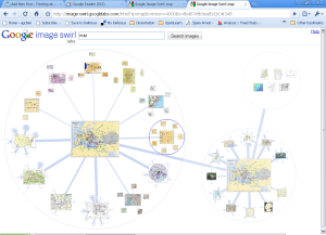
My last post was unexpectedly timely. I was catching up on recent posts at Flowing Data yesterday and discovered that Google Image Swirl are working on much the same approach to Image Search over in Google Labs.

Being Google, it’s cooler, richer and far, far cleverer.  It also confirms my view that this method is good for situations where you want to hide the irrelevant stuff.

Here – have a go:

Google Image Swirl

Google Image Swirl

Enjoy.

Interactive Mapping – too cool a tool?

Some years ago, my friend Justin showed me a copy of Visual Thesaurus. I squealed with delight, which is always embarrassing at work. Click on the image below to see why.  (All the images in this post link to the examples, by the way).

Visual Thesaurus

Visual Thesaurus

Recently I came across an open source version of the technology underlying Visual Thesaurus at spicynodes.org.

What am I talking about?  Well, this is a way to present information so that people can explore it in a naturalistic way by clicking from concept to concept in an interactive ‘map’.  But seductive though it is, it’s  not always the best way to present information.

The Good

This approach is helpful when you want to hide the options you reject.  This can be with a rich and complex subject (the Visual Thesaurus) or a simple tree structure, as with the catalogue below.   It may not be the best choice for a catalogue but in this case I think it works.

A good example of the tool, used as a catalogue

This catalogue works well

It helps if the subject matter is well understood: this example covers the solar system and seems to have been abandoned, which is a shame.  If you click Sun > Mars > Phobos you realise what a neat explanation of the solar system this could be.

Solar System

Providing information on a familiar subject

The technology also lends itself to certain forms of artistic endeavour, I like this one in particular:

Poetry Site

A poetic journey

It’s also been used with reasonable success to  deliver Haiku

I think the technology lends itself to this sort of artistically guided happenstance, and I can certainly imagine an artistic installation along these lines.

The Bad

I looked at well over a hundred of these maps, and those the best. The worst are dreadful.

Do not use this technique if your users are likely to want to step backwards and forwards through the navigation.  This is how people navigate when they want to be sure they”ve not missed anything.  SpicyNodes own home page shows how exasperating this approach can be.

Spicy Nodes Home Page

Spicy Nodes own home page

Don’t use it when a simpler tool would do.  Whoever created the example below was on top of their data, but their information would be much better presented in the form of bulleted slides. Using the interactive map just makes it unnecessarily fussy:

Migrating Sales Online

A bulleted list would be better

Here we see how important it is to get the hierarchical structure right. The map below is an A-Z of the world’s nations. But wouldn’t it have been more interesting to have them organised by geographical region? If you want an A-Z list, then I think a simple A-Z list would be better and would take up less space.

A-Z of Nations

A-Z But is this the best use of the space?

And this is the worst scenario of all: a navigation tool for a web-site.  It actually subtracts value, because it takes up the whole page and makes it hard to view the content of the site in a logical sequence. It’s a relief to know the organisation concerned has a traditional side and top navigation structure.

Site Navigation

Site Navigation - high on gimmick and short on benefit

Finally, I wasn’t sure how to categorise this map (which I found fascinating, by the way).  It would make a good teaching aid but it’s not particularly good for conveying information.

Study Notes

Teaching Aid

So where does that leave us?

Firstly it’s clever but not necessarily helpful. In fact mapping something this way is only useful when people know what they want to find out and want to ignore everything else: if they need an even view of the whole subject matter then this is not the tool to use.

Secondly it’s good for a certain type of artistic expression; it wouldn’t surprise me to see something like this in a gallery.

And finally, creating this sort of map is time-consuming and you really have to understand your data well, and so do your users.

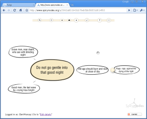
I struggled to think of a situation where this would be the best tool for presenting data so I decided to go the artistic route, and see if it added anything to the experience of the sort of poem with repeated lines.

Vilanelle - Dylan Thomas' Do not go gentle into that good night

Dylan Thomas's Villanelle - Do not go gentle into that good night

I have to conclude that it doesn’t, but it was fun trying.


Add to FacebookAdd to DiggAdd to Del.icio.usAdd to StumbleuponAdd to RedditAdd to BlinklistAdd to TwitterAdd to TechnoratiAdd to Yahoo BuzzAdd to Newsvine

Not drowning but waving

Woo Hoo!

My Google Wave invitation came through today and – even cooler than that – I was able to use it (very slowly and clunkily) for real within an hour of receiving the email.  Long distance relationships sometimes have unexpected advantages.

Google Wave

Google Wave

How sad is it that I am really thrilled and excited about this!

The Business Analyst: Facilitator or Designer?

Craig challenged me on the role of the BA recently.  I said that Web 2.0 is something you can only understand in practice and he posted:

Having said that what do you say to the role of the professional Business analyst; the person who doesn’t use the system but makes many of the key decisions about what goes into it?

It’s a good question and one I’ve been mulling over since he asked it. For the sake of brevity I’m going to park the generic question ‘what is the role of the Business Analyst’ and the vexed issue of whether or not the user should be the primary arbiter of what goes into a system.

Users do know about user experience.  One of the things I like about Lean Interventions is that you go to the people enmeshed in using the process and get them to re-design it.  If a BA has a role in this, it’s as an educator about Lean principles and as a facilitator. The BA does not design the process, the people using the process do that.  I should probably also mention focus groups as a way of involving users in the design phase, but I can’t really comment since I’ve never worked in that way.

But users are rarely available. In my career to date the actual end user has rarely had a seat at the table because with web stuff the user is quite often outside the organisation.   The Business is frequently the proxy for the user, and the Business is sometimes the team sponsoring the system, but it can also be a programme team whose expertise is in change not the system they are changing.  Either way they are representing the user, which brings us back to the underlying question:

‘is it possible for the user to be represented by anyone else?’

After thinking about it for some days and toying with this post for several hours, I think the short answer to that one is: Not always, but that is what use cases 1 are for.’

So what to do about it?

I’ve mentioned focus groups, though I’ve not run any myself.  But let’s hear a shout out for prototypes and pilot studies here. Oh, the difference when you prototype a user journey! It’s like having a mystery shopper before the shop has opened. The great joy of a prototype is that the thing comes to life and suddenly everyone involved can have a go at being a user, and pilot implementations tell you where the weak spots are. This is closely linked to O’Reilly’s perpetual beta of course, and is also why Anything 2.0 is better than Anything 1.0.

Craig didn’t ask whether the BA could represent the user, he actually asked:

What do you say to the role of the professional Business Analyst?

I think my answer is that the BA should be a facilitator not a designer.  The facilitator enables the Business to produce a design that IT can use whereas a designer does that for them.  (Other operating models are available). It’s the BA’s job to use tools like use cases and prototypes to help the Business represent the user. That doesn’t mean the Business will do a good job of representing the user, but it’s a step closer than if the BA tries to do it. And even so, it’s a tad idealistic. At times the Business Analyst who’s a facilitator has to make calls that affect the design, but I think that’s something that we shouldn’t do by default.

As  you can see, Craig’s question gave me pause for a considerable amount of thought, a lot of it typed directly into this post and most of it cut straight  out again.  To pull it all together:

  • Organisations deliver user-aggressive or ineffective systems for a myriad of reasons which include
    • organisational culture during the design stage resulting in a lack of user representation
    • pressures of time and cost
      which frequently result in
    • methodologies which lack rigour, in particular sloppy requirements definition and sign-off
  • Good design requires holistic systems thinking (that’s one for the buzzword bingo) which incorporates the user’s point of view
  • Only users are users, but tools like use cases, user journeys, prototyping and testing get you closer
  • Ideally, the BA’s role is as a facilitator rather than a designer
  • The local challenge is whether you
    • go directly to the user (eg a Lean Intervention)
    • allow the Business to act as a proxy (so much of my life to date)
    • use a prototype, or focus group or pilot study (love those)

I’m quite surprised Web 2.0 evangelists aren’t yet hypothesising Open Source Organisation Design which would be well wiki’d.

(Boom boom).

O’Reilly says ‘Users must be treated as co-developers’ which takes open source software build on into open source software design. If he or anyone else has taken this idea into the realms of open source organisation design and I’ve missed it, please drop a link in the comments.


1 – a Use Case is – for want of a better term – a scenario: ‘A white horse walks into a bar’; ‘A funny thing happened on the way to the theatre’; ‘Writing a blog, (what’s that all about)’. A use case can be large: ‘Government bails out banks’ or small ‘Customer buys a bottle of milk’.  If you want a less flippant definition, here’s the one from Wikipedia. But much better to go back to post


Add to FacebookAdd to DiggAdd to Del.icio.usAdd to StumbleuponAdd to RedditAdd to BlinklistAdd to TwitterAdd to TechnoratiAdd to Yahoo BuzzAdd to Newsvine

The medium is the instant message

About 10 years ago I was introduced to the delights of Instant Messenger by a team of American colleagues when it was relatively new and rarely used in Europe. I took to it instantly, if you will forgive my choice of adverb. I can’t be alone in finding it a useful way to compare notes or check facts with team-members during formal conference calls.

Recently the boot was on the other foot. Usually the call is the main deal and chat just supplements it, but this time it was the other way round. I was pinged by someone who hadn’t been updated with the latest departmental news; while we were typing back and forth I realised I needed to be certain what was public domain information and what was still under wraps. The obvious person to check this with was on the road so I rang them.

A decidedly odd inversion.

So… instant messaging… love it or loathe it?

How will the corporation subvert Web 2.0?

Throwing Sheep in the Boardroom

Throwing Sheep in the Boardroom

It’s an exciting idea, the way that Web 2.0 will transform the world of work, making collaboration the norm by providing wikis, bosses opening up dialogues by posting blogs that are open for comments, replacing meetings with discussion boards.

But before we get to that nirvana, we will have to live with the worrying answers to the question ‘how will the corporation subvert Web 2.0’

In the long term the Luddites always lose. In the long term the organisations which embrace Web 2.o will over-take those which resist it, just as Amazon has flooded out the bookshops and iTunes and Spotify have all but destroyed the the record companies.

What worries me, is the nature of that embrace.

Web 2.0, briefly, comprises the tools and attitudes that enable me to blog and enable you to rate my post and comment on it.  It’s FaceBook and Twitter and citizen journalism and mash-ups and crowd-sourcing and ‘Here comes everybody’.  It’s MySpace instead of A&R  It’s Wikipedia instead of the Brittanica. It’s Twitter instead of… well… instead of no Twitter. Web 2.0, so we all thought, is a force for democracy and good.  It cuts out the parasitical middle-person, it empowers individuals and enables them to form groups and enables those groups to face down corporations and governments.  It puts artists directly in touch with their audience. It enables me to publish this and you to read it with no more cost than our time. It turns base metal into gold and chocolate into a slimming aid.

There are, it seems, two current views of what happens when Web 2.0 meets the Enterprise.  In the first view, Web 2.0 brings about innovative, hierarchically flat organisations where knowledge is freely shared, where anyone who comes up with a bright idea can get it aired and taken up, where discussion boards pwn meetings and where gatekeepers and barriers to innovation are no more.  Google is reported to be just such a place.  The other view is that Web 2.0 and the enterprise are oil and water:  executives and managers will resist Web 2.0 either because they don’t get it, because they think it is a distraction, or because they are just plain running scared.

But I am not convinced by either.  Web 2.0, combined with an internal search engine, are powerful surveillance tools.  Any well-governed Wiki will tell you exactly who made which changes when, and far more neatly than you can track the changes in Word.   You can capture Instant Messenger logs and run searches on them in a way which you cannot tape and search conversations by the water cooler.  Nobody minutes meetings any more, but a discussion forum can be there for as long and the server farm lasts and longer.

Web 2.0 facilitates networks and interactions, but it also makes them more visible, and therefore easier to track.  We already know that the web is destroying privacy.  These days it takes diligence, vigilance and consistency to hide in cyberspace.  It is hard not have your name published by other people when school mates tag you on photos in FaceBook.

So it is surprising that hierarchical organisations don’t espouse Web 2.0 tools more actively, and this supports the theory that this is because execs and managers just don’t get it.

As something of a Web 2.0 evangelist, that places me on the horns of a dilemma.  A trilemma, actually. Do I:

  1. promote Web 2.o tools because they empower people and democratise knowledge
  2. stop promoting Web 2.0 tools because they expose people by turning situations which they are used to considering private into permanent searchable records or
  3. use the argument that they can improve audit and accountability in order to get them into an organisation because they are just so flippin’ COOOL?

For some of the thinking that led me to this impasse see:
Throwing Sheep in the Boardroom – Matthew Fraser & Soumitra Dutta


Like this post? Please share it:

Add to FacebookAdd to DiggAdd to Del.icio.usAdd to StumbleuponAdd to RedditAdd to BlinklistAdd to TwitterAdd to TechnoratiAdd to Yahoo BuzzAdd to Newsvine

Include me out

It’s not always obvious how our tools can distort our methods.

A colleague who was co-ordinating a social event recently sent out an email asking us to say what kind of food we’d prefer by using the voting buttons in our reply.  The choices were Indian, Chinese, Italian, No Preference.   “Cool use of the tool” I thought.

It was only a few days later that another colleague said how disappointed she was that the most popular option was Indian, because she really doesn’t like Indian food.  (How can anyone not like Indian food? – But that’s another bemusement for another day).

It was then that I realised that what was needed was not voting buttons, but vetoing buttons, with the option for vetoing more than one choice.

I’d have made the same mistake, and it’s an interesting one.

Unexpectedly Delicious

Ok, I’m feeling naive now, because  I hadn’t realised what a great portal Delicious is and how easily it helps you tap into the NetGeist.  I am annoyed with myself about this, because I’ve used Delicious for over a year now.

So – what is Delicious?  It’s a site that makes it easy to manage your bookmarks and favourites so you are never more than a couple of clicks from any link that you might want to go back to.  Suddenly moving from PC to PC doesn’t matter because your bookmarks are always there, even if you are a hot desker at by day or an internet cafe user by night or just a browser tart like me.

What’s new for me is just how good Delicious is as a portal into the web. For the last 18 months or so my start page has been Google News, so no wonder my surfing’s been dreary:  I’ve read more of the Daily Mail than is good for anyone.  (How do they get to be the main link for a story so often?)  Delicious is a much cooler way to tap into the NetGeist.  My favourite Favourite is Fresh Bookmarks, but there are others.  Fresh Bookmarks shows you what’s been bookmarked recently and by how many people.  And this is part of the power of Delicious:  it’s an automatic ranking system based on self-interest rather than altruism, so it works.

You use tags to sort out your bookmarks, and the collective tagging within Delicious forms what is sometimes called a Folksonomy.  For a while I found it hard to find links which had been tagged using the tags I use for my own bookmarks, but in fact that’s easily done using the Subscriptions feature, which gives you more control than an automated feature would.

The other thing that I hadn’t realised is how easy it is to discover who’s got a specific page or site bookmarked, like this blog for instance. (And a special Shout Out to Simon, here.  Hey! Simon! I said it was cool!).  I keep track of myself on Google and Technorati of course, and I’ve found at least 4 other Ben Warsops on Facebook, but it hadn’t occurred to me that anyone thinks I’m Delicious.

I do give myself credit for realising that Delicous lets other people take a look at what you’ve bookmarked.  Feel free to take a look at my bookmarks: you’ll find them rather serious, because I mark recipes and shoes and pages about SatNavs private, but that’s because my account is in my own name.

In summary: Delicious – so much cooler than I thought.


Like this post? Click to share:

Add to FacebookAdd to DiggAdd to Del.icio.usAdd to StumbleuponAdd to RedditAdd to BlinklistAdd to TwitterAdd to TechnoratiAdd to Yahoo BuzzAdd to Newsvine